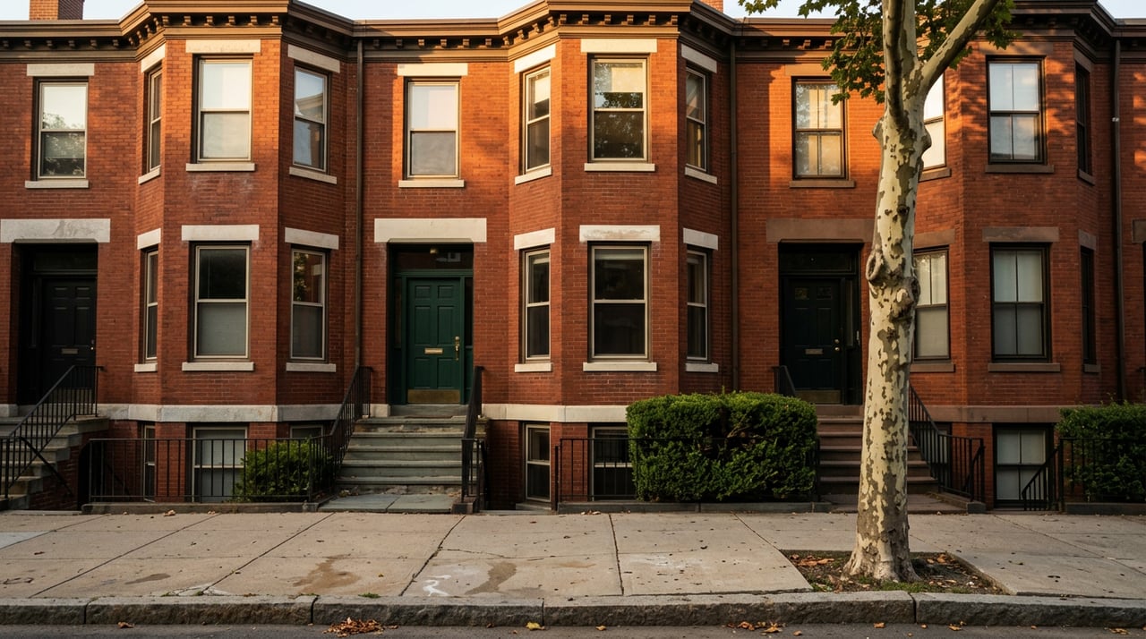
The Manhattan-Brooklyn Rent Gap Is Real. It's Just Not Where You Think It Is.
September 24, 2026
September 24, 2026
A renter named Alexandra Dye told Bloomberg this summer that she paid an agent $4,000 just to see a Brooklyn apartment listing. She'd reached out about a different unit on StreetEasy, was told it was gone, and was offered a look at another one instead, provided she paid a fee up front. She paid it, signed a lease for a two-bedroom priced 60 percent below market rate, and later said she "still felt a little taken advantage of."
That story ran more than a year after New York's FARE Act was supposed to end exactly this kind of arrangement. It's a useful place to start, because it captures something the monthly rent charts don't: the gap between what Manhattan costs and what Brooklyn costs isn't just a number. It's a moving target shaped by which report you're reading, which neighborhood you actually mean when you say "Brooklyn," and how a well-intentioned law changed the fee structure without touching the supply problem underneath it.
If you've been watching headlines this year, you've probably seen two different stories about Brooklyn rent. One says Brooklyn is still the more affordable borough, holding a steady few hundred dollars below Manhattan. The other says Brooklyn is catching up fast, with year-over-year growth rates that dwarf Manhattan's.
Both are technically true. They just come from different data providers measuring different things.
| Month | Data Source | Manhattan Median | Brooklyn Median | Gap |
|---|---|---|---|---|
| March 2026 | Corcoran | $5,000 | $4,150 | $850 |
| June 2026 | Corcoran | $5,295 | $4,350 | $945 |
| July 2026 | The Real Deal / Miller Samuel | $5,000 | $4,500 | $500 |
| August 2026 | Corcoran | $5,285 | $4,368 | $917 |
Look at that July row. Reported by Brick Underground, it comes from a newer joint effort between The Real Deal and appraiser Jonathan Miller, and it shows the gap nearly collapsing to $500. But Corcoran's own consistent monthly series, tracked by the same outlet just one month later, put the gap back at $917 in August, a level roughly in line with where it sat back in March and June.
Neither report is wrong. They use different samples, different weighting, and different definitions of what counts as a listing. The lesson for anyone comparing these two boroughs right now isn't "the gap is $500" or "the gap is $945." It's that a single month's rent comparison, pulled from a single source, tells you less than a consistent series from one provider tracked over time. Judged that way, using Corcoran's own numbers across the year, the Manhattan-Brooklyn gap has held in a fairly narrow band. It has not meaningfully closed. It has also not meaningfully widened. It's just been reported inconsistently by people mixing sources.
Here's the part that actually matters more than the borough-wide median: "Brooklyn" as a single number is close to meaningless if you're trying to figure out whether you'd actually save money moving there.
In June 2026, the average rent in South Williamsburg hit $6,569, up 44 percent from $4,571 a year earlier. DUMBO climbed to $8,513, a 33 percent jump from $6,406, according to figures reported by amNewYork. Both numbers sit well above Manhattan's own borough-wide median for the same month. If your mental model of "moving to Brooklyn to save money" is built around the neighborhoods that show up in real estate coverage most often, waterfront, close to the L or the F train, walkable to the water, you're comparing yourself to a market that's already pricing like Manhattan or beyond it.
The borough median looks affordable because it includes everything else. And everything else is doing a lot of work to pull that number down.
If the discount isn't in Williamsburg or DUMBO, where is it? The pattern that shows up consistently in 2026 market coverage points further from the waterfront: Bay Ridge, Midwood, East Flatbush, Sheepshead Bay, Canarsie, Brighton Beach, and East New York. These are the neighborhoods where a renter priced out of Manhattan, or priced out of North Brooklyn, tends to land when the math starts to matter more than proximity to the last L train stop.
This isn't a coincidence of geography. It's what happens when a borough's median rent is pulled up by a handful of high-demand waterfront pockets while its outer neighborhoods, further from the East River and further from the subway lines that get the most attention, absorb the actual spillover. If you're doing the Manhattan-versus-Brooklyn math for yourself, the useful question isn't "what does Brooklyn cost." It's "what does the specific neighborhood I'm considering cost, and is it one of the ones absorbing demand or one of the ones already priced like Manhattan."
The other piece of this puzzle is the law that was supposed to make all of this more transparent. The FARE Act took effect on June 11, 2025, and its core rule is simple: whoever hires the broker pays the broker. For most renters, that meant landlords, not tenants, would cover the fee that used to run 12 to 15 percent of a year's rent, according to NYC's Department of Consumer and Worker Protection.
A year in, the trade-off looks roughly like this. Broker-listed rents rose modestly, adding something in the neighborhood of $38 a month on an average unit, based on StreetEasy's own tracking of the market. In exchange, renters have been saving thousands upfront at lease signing compared to the old fee structure. That's a real and meaningful shift for anyone who has ever had to come up with first month, last month, security deposit, and a broker fee all at once just to get keys.
But the Dye story points to the part the law didn't fix. Because a broker who publishes a listing is legally presumed to be working for the landlord and therefore can't charge the tenant, some agents have started charging separate fees framed as something else entirely, an "access fee," before they'll even show a unit. The Real Deal reported in August that as of July, the city's enforcement agency had issued more than $36,000 in penalties for FARE Act violations and returned more than $15,000 to renters. Enforcement is happening. It just hasn't caught up to every workaround yet.
The bigger point is that the FARE Act changed who writes the check and when. It didn't change how few apartments are actually available, and scarcity is still what's driving prices in both boroughs.
Put these three threads together and the thesis is straightforward: the Manhattan-Brooklyn rent gap is a real phenomenon, but the number attached to it depends heavily on whose report you read, and the borough-wide comparison obscures more than it reveals. A renter or buyer weighing Manhattan against "Brooklyn" is really weighing Manhattan against several very different Brooklyns at once, some of which cost as much as Manhattan and some of which don't.
If you're doing this comparison for yourself, the practical move is to stop comparing boroughs and start comparing specific neighborhoods against your specific budget. Ask what a given block actually rents for this month, not what the borough averaged six months ago. Ask whether the fee structure on a listing reflects the FARE Act as written or one of its workarounds. And if you're a Brooklyn homeowner watching these rent records climb and wondering what that means for your own property, that's a different but related question worth asking too.
Is Brooklyn actually cheaper than Manhattan in 2026? On a borough-wide basis, yes, Brooklyn's median rent has stayed several hundred dollars below Manhattan's through most of 2026. But that gap narrows or disappears entirely in waterfront neighborhoods like Williamsburg and DUMBO, and widens further out in neighborhoods like Bay Ridge, East Flatbush, Sheepshead Bay, and Canarsie.
Did the FARE Act actually save renters money? Broadly, yes, on upfront costs. Most renters are no longer paying a broker fee equal to a month or more of rent just to sign a lease. Asking rents rose only slightly in response. The exception is a small number of cases where agents have shifted to separate access or showing fees, which the city has been actively penalizing.
Which Brooklyn neighborhoods currently offer the most relative value compared to Manhattan? Based on 2026 market coverage, the neighborhoods furthest from the immediate waterfront and closest to the outer edges of the borough, including Bay Ridge, East Flatbush, Sheepshead Bay, and Canarsie, have consistently shown up as where budget-conscious renters find more room for their money.
If you're trying to figure out what any of this means for your own move, or what it means for a property you already own, the team at Revived Residential knows these blocks street by street, not just borough by borough. If rising rents in your neighborhood have you wondering what your home is worth right now, Get Your Instant Home Valuation and get a number grounded in this year's actual market, not last year's headlines.
Stay up to date on the latest real estate trends.
We are friendly, easy to talk to, and easy to understand. We’re not intimidating or judgmental — so clients from all walks of life feel comfortable talking to us about their real estate needs and concerns. Our messaging is warm, sincere, and familiar. We’re not money-driven.

Phone: (917) 459-7681
Email: [email protected]
Phone: (929) 379-3750
Email: [email protected]
2124 Flatbush Avenue
Brooklyn NY 11234
426 4th Avenue
Brooklyn NY 11215